I found some good tips on decorating shared rooms (like, for your kids) and since I happen to have a friend that wants to put her children in one room and the toy room in the other, I thought these might be some helpful hints:
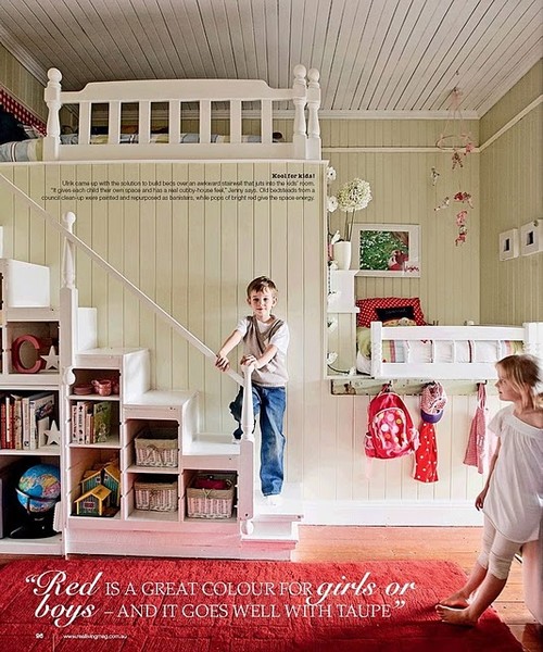
Layout- Think of the room in different zones. Each kid needs their own, private zone and you also need a shared zone.
if only we were all so lucky to have such a HUGE room for our kids. but you get the idea. this room is split into sections, so the kids don't have to feel too crowded. and, just as the picture says, they chose a good color- RED. it works for boys AND girls. and they left everything else a little more neutral.


Storage- With more than one kid in a room, storage is a necessity. This is something I've learned, since my boys share a room. Baskets, boxes, shelves! These are key. Fill the corners.
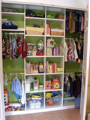
Even in my boys' closet, we didn't just hang clothes and put toys on the floor. We have a toy box in there with the big toys, a plastic dresser for clothes, pull-ups on top of the dresser, clothes hung, a shelf on the ground with designated areas, one up high with a basket for balls, and a place for other big things that we don't use as often. And it's really not a big closet, in my opinion. Maybe, just maybe, if I'm feeling up to it, I'll post a picture in a day or two. : )
in the meantime, here's one from Houzz. I like how they painted the wall, too. it makes it cohesive. it'd look amazing with some pretty wallpaper, too, like this.
Aesthetics- Here's the tricky part. How do you get everything to mesh into one room. It doesn't necessarily have to be matchy matchy. Keep it simple. You could start with neutrals and have a coordinating color for each kid's individual zone. Or you CAN make it matchy matchy but SIMPLE is key.
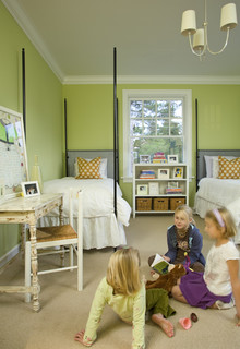
here's an example of a matchy room, from my ideabook. it works because it's simple. I love the colors. Something like this could transfer a girl from tween to teen effortlessly. and, notice the STORAGE.
traditional kids design by san francisco interior designer Amoroso Design
hope those tips help someone in need. if nothing else, you got to see some prettily decorated rooms, and that'll make anyone's day.


No comments:
Post a Comment